OnTrack is a package-tracking app to help users stay informed about the status of their deliveries.
OnTrack

This project served as my Capstone Project for the UX Design Bootcamp, applying the skills I learned to a real-world challenge.
Background
Role
UX Designer, UI Designer, UX Researcher
Duration
8 weeks
Tools
Figma
GOAL
How might we help online shoppers to feel more secure about package deliveries?
Research + Analysis
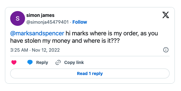
Canadians have had approximately $784 million worth of packages stolen. There is a lack of security and control during deliveries that lead to this amount of loss. With 90% of consumers shopping online, the problem is only increasing due to the challenges of theft prevention.
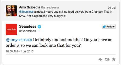
For customers, these thefts not only result in financial losses for consumers but also create frustration, inconvenience, and a potential hesitation to continue shopping online.
For businesses, they face lost sales, damaged customer relationships, and the burden of dealing with replacement deliveries.
Problem
To gain a deeper understanding of online shoppers' frustrations with package theft, I conducted one-on-one interviews with five individuals who has experienced it. This qualitative approach allowed me to gather in-depth, personalized insights into their attitudes, behaviors, and pain points regarding package delivery security.
Here are the common themes I found:
A stolen package disrupts their sense of home security.
Convenience outweighs concerns, driving, continued online shopping.
To ease anxieties around package theft, shoppers seek the assurance of immediate tracking numbers after purchase.
One bad delivery can cast doubt on a company’s reliability for online shoppers.
Ideation
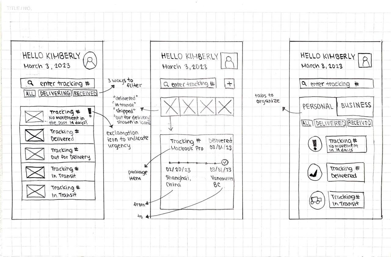
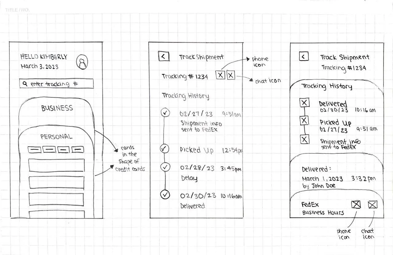
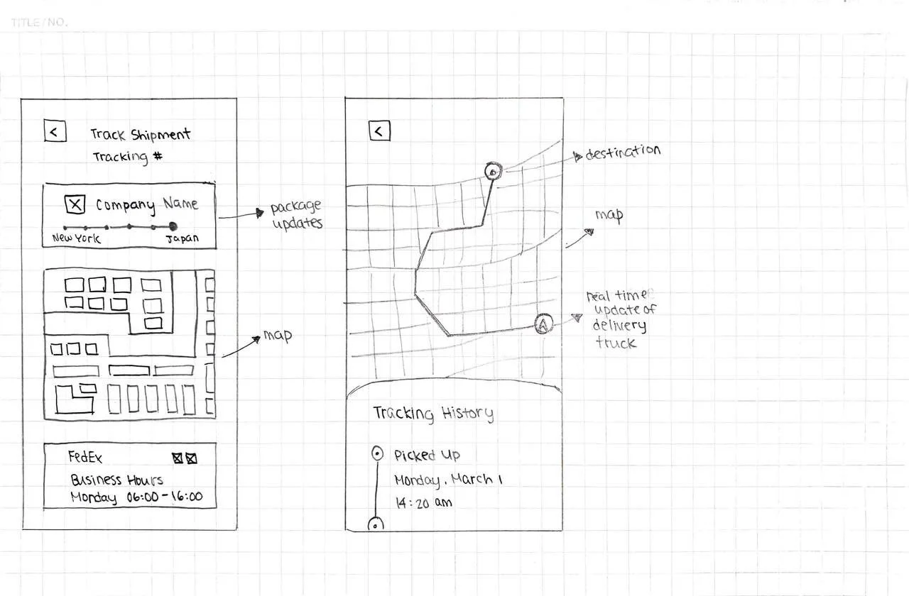
Through a series of sketches, I compared and evaluated different layouts and features, ultimately selecting the best options for the Home Page and Track Shipment Page.
With the combination of different layouts and features, I designed the mid-fi wireframes to start bringing my product to life.
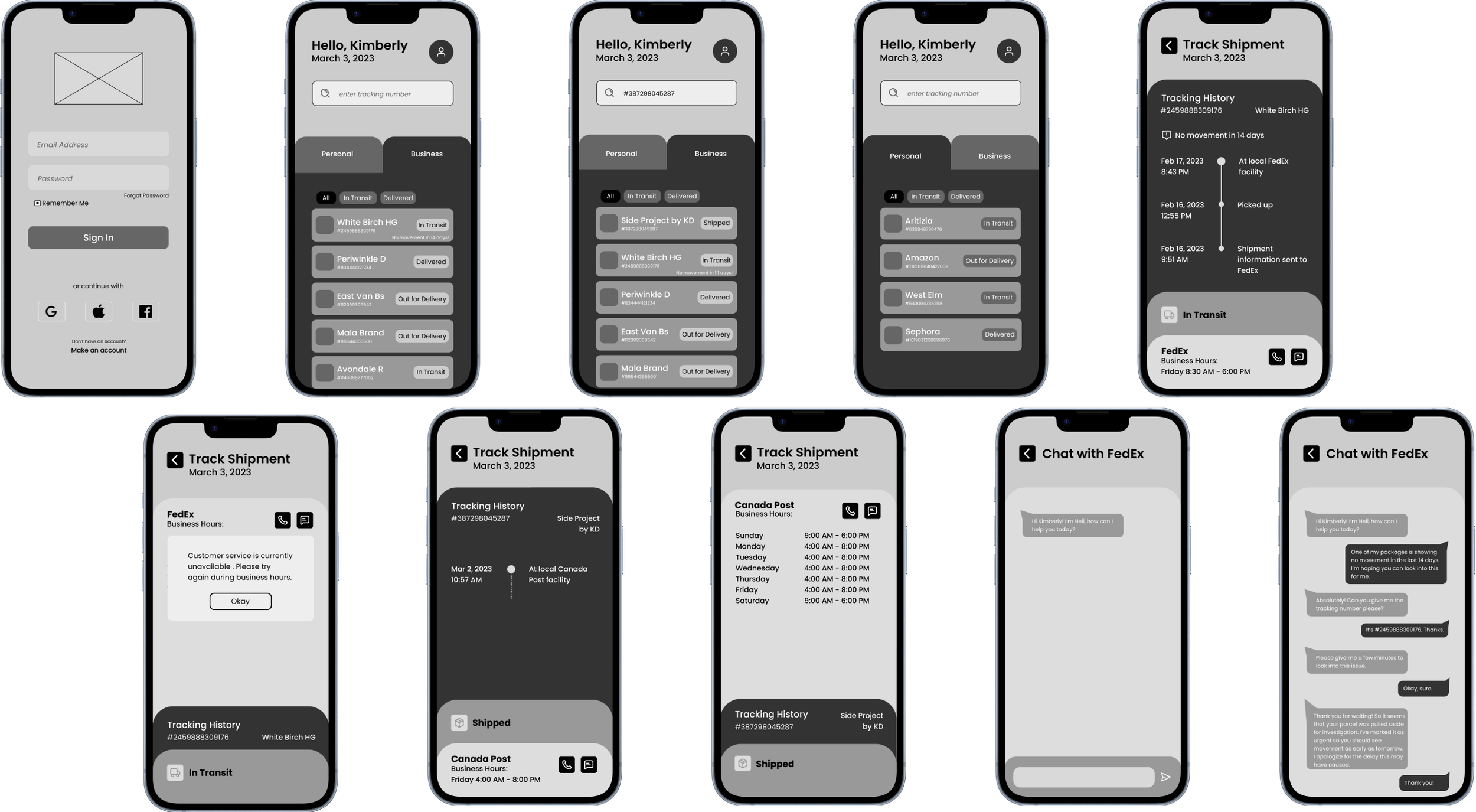
I conducted usability testing with a total of 10 users across two sessions in-person. The feedback yielded valuable insights on user behaviour, including confusion around certain functionalities and suggestions for improving the overall flow.
Feedback + Iteration
Session 1
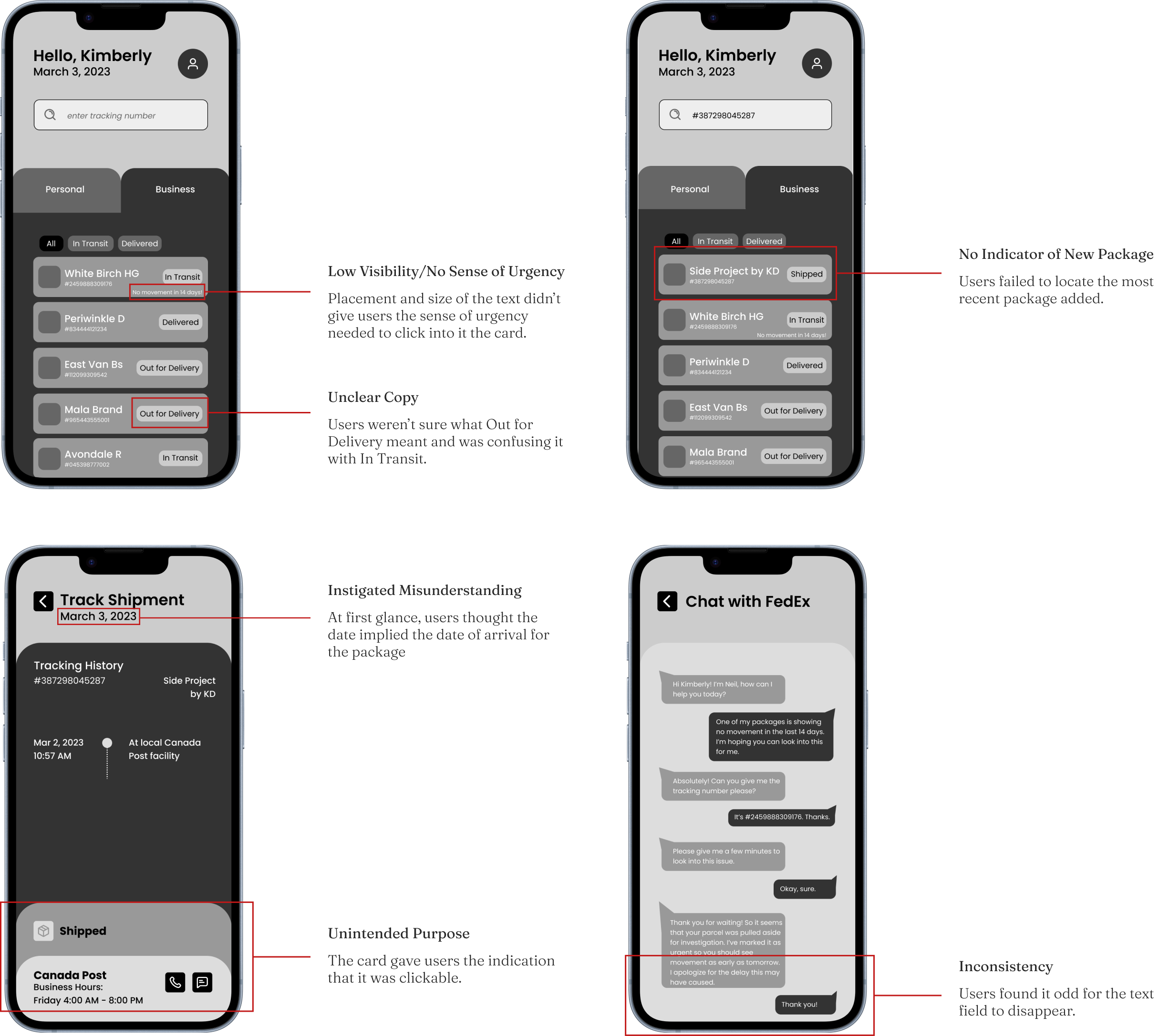
After the first session, I made the following changes:
Replaced “No movement in 14 days!” message with an exclamation point icon
Replaced Out for Delivery with In Transit to provide clarity
Added a modal to notify users when a new package has been added
Removed date in Track Shipment page to avoid confusion
Removed Delivery Status card and incorporated information with Tracking History card
Added a text field for consistency
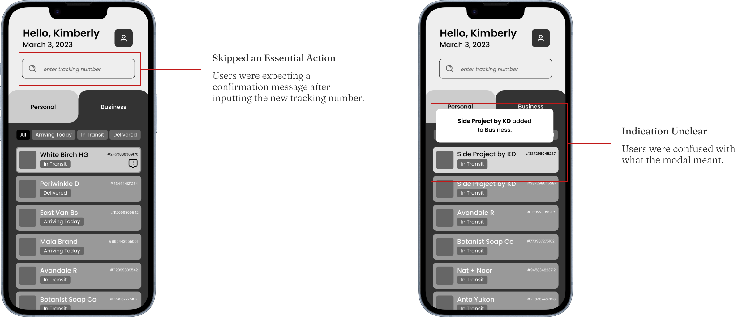
Session 2
After the SECOND session, I made the following changes:
Created a Track a New Shipment page for users to confirm before it’s added
Added an animation to indicate new package has been added
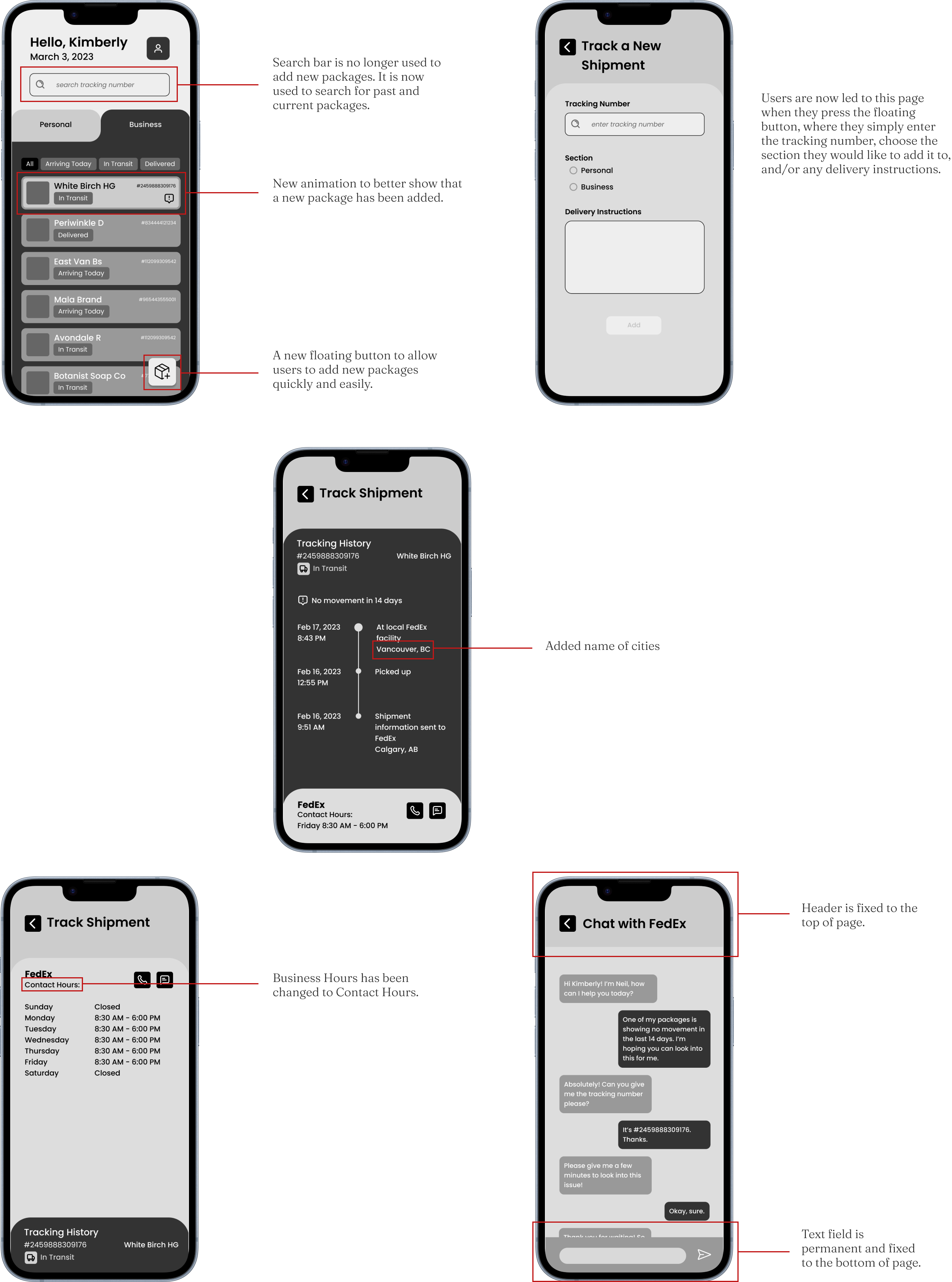
Final Iteration
Brand
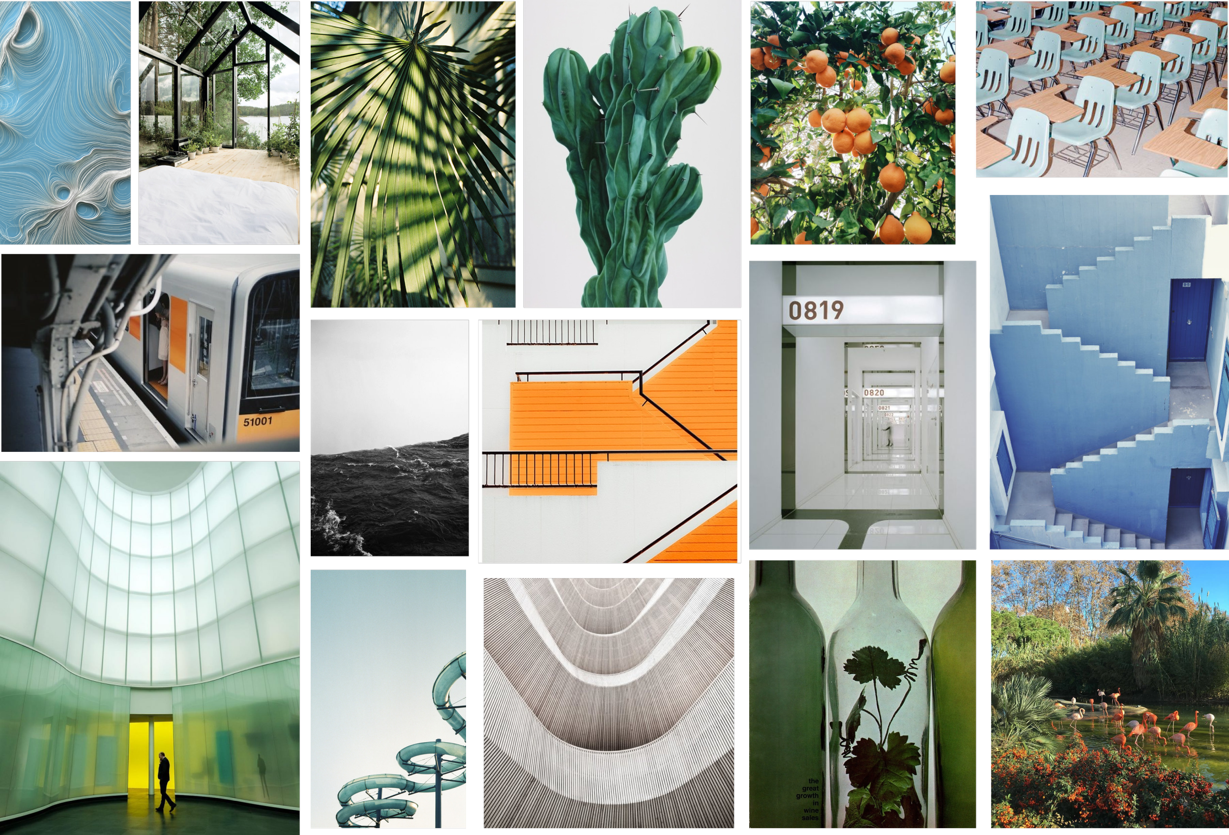
I put together a moodboard for inspiration. I wanted colours that portrayed reliability, organization, and efficiency. Therefore, I wanted green tones with pop of blue and orange.
I extracted colours from my moodboard to create this colour palette.

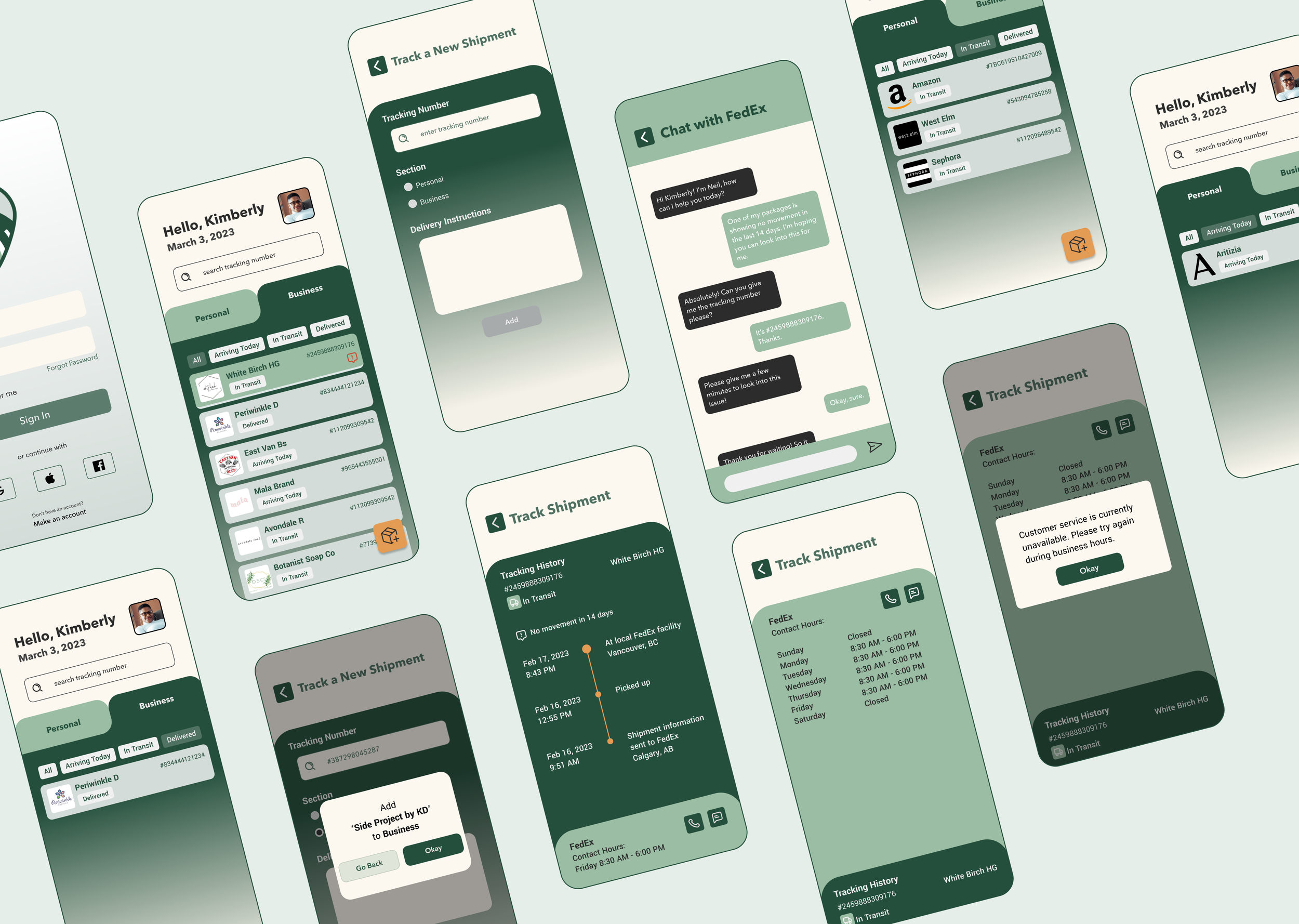
Final Product
Have a look at the final product for yourself!
Takeaways
Testing Often
I came to appreciate the critical importance of frequent testing. Engaging with diverse user testers highlighted the significance of varied perspectives and insights. This iterative approach not only enriched my understanding but also helped to pivot and adjust the project trajectory based on valuable user feedback.
Non-Bias User Testers
During my user testing sessions, I included participants who were not part of the UX Design Bootcamp I attended. This decision proved invaluable as it provided a fresh and uninfluenced perspective. Since these participants lacked prior knowledge of the project or any formal design background, their feedback offered a unique lens through which to evaluate the user experience. Their unbiased insights shed light on aspects that might have been overlooked or taken for granted by those more familiar with the project or design principles.
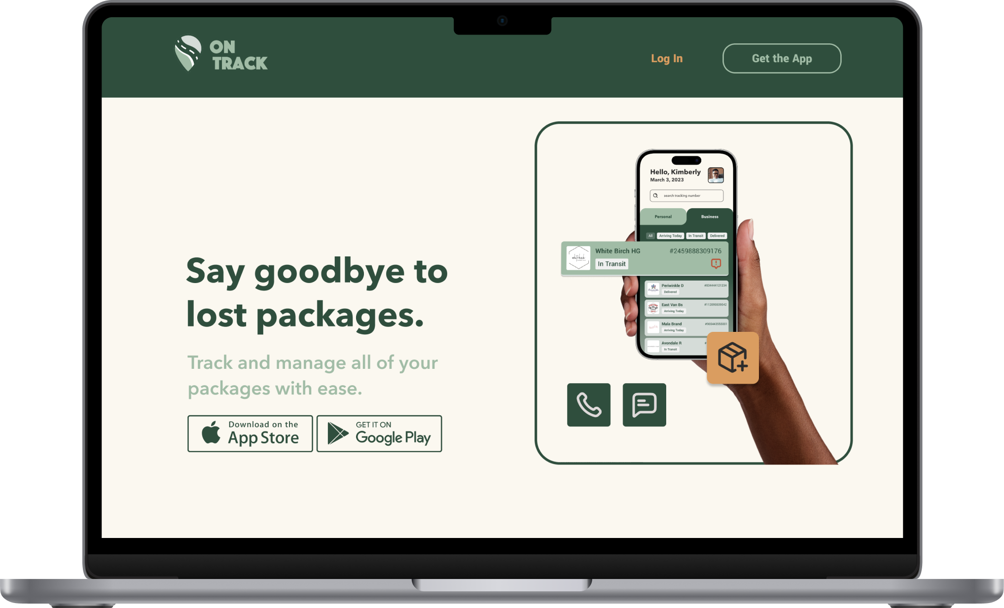
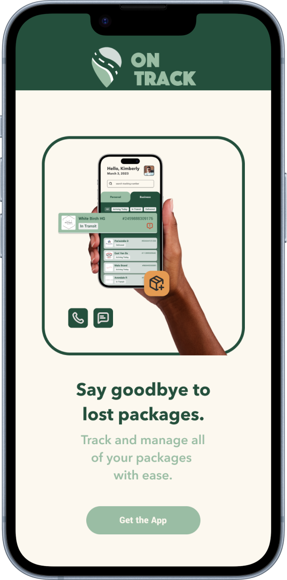
Marketing Website
As a bonus, I designed a marketing website in desktop and mobile viewport that showcases the features of my app. I used the same colour palette and typography for consistency. And to make it more eye-catching, I added movement with the images.